NeuGenPower
Energy · Website & Dashboard · 2025
NeuGenPower is a new UK-based energy brand and website concept designed for a new generation of users. Energy is confusing, so the job was to make plans, usage and sharing feel simple enough to trust.
I followed the Double Diamond from research to delivery, and designed every screen across three breakpoints from day one.
Situation What was the problem or issue that I faced?
NeuGenPower needed a new UK energy brand and website concept that made complex energy information easy to understand for a modern, digital-first audience.
Task What did I have to do to fix this?
I was responsible for designing a user-centred website and web app that clearly explained energy plans, built trust and met accessibility and usability best practices.
Action What were the steps that I took?
I owned the project end to end, from research to the website and customer panel. I followed the Double Diamond, applied WCAG and Nielsen’s heuristics, and simplified the structure and navigation. To make energy engaging, I added gamification and energy sharing with neighbours, so customers can save more on their bills.
Result What happened and what was the benefit?
The final concept made energy information more transparent and easier to compare, improved clarity and perceived trust, and provided a scalable, accessible design foundation for the brand’s digital presence.
Process
The work followed the Double Diamond across 12 weeks. This page is organised the same way, so every decision can be traced from research to release.


Research, interviews, competitor audit
Jakob Nielsen’s heuristics kept usability and consistency in check through every phase, and the WCAG kept it accessible.
Discover
Understanding the market, the people in it and what competitors already get right.
Who it’s for
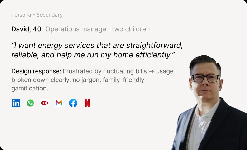
Demographic research across the UK pointed to two audiences with very different expectations of an energy supplier.
- Primary · 18–35
- Digital-first renters, young professionals and EV owners. Price- and eco-conscious, short attention span, expect interaction over reading.
- Secondary · 35–70
- Families and stability seekers. Want reliability, predictable bills and support that is easy to reach.
Three market problems framed the brief: cost sensitivity (households value predictable bills over the cheapest rate), low trust in traditional suppliers, and a high barrier to entry for green technology.
Personas
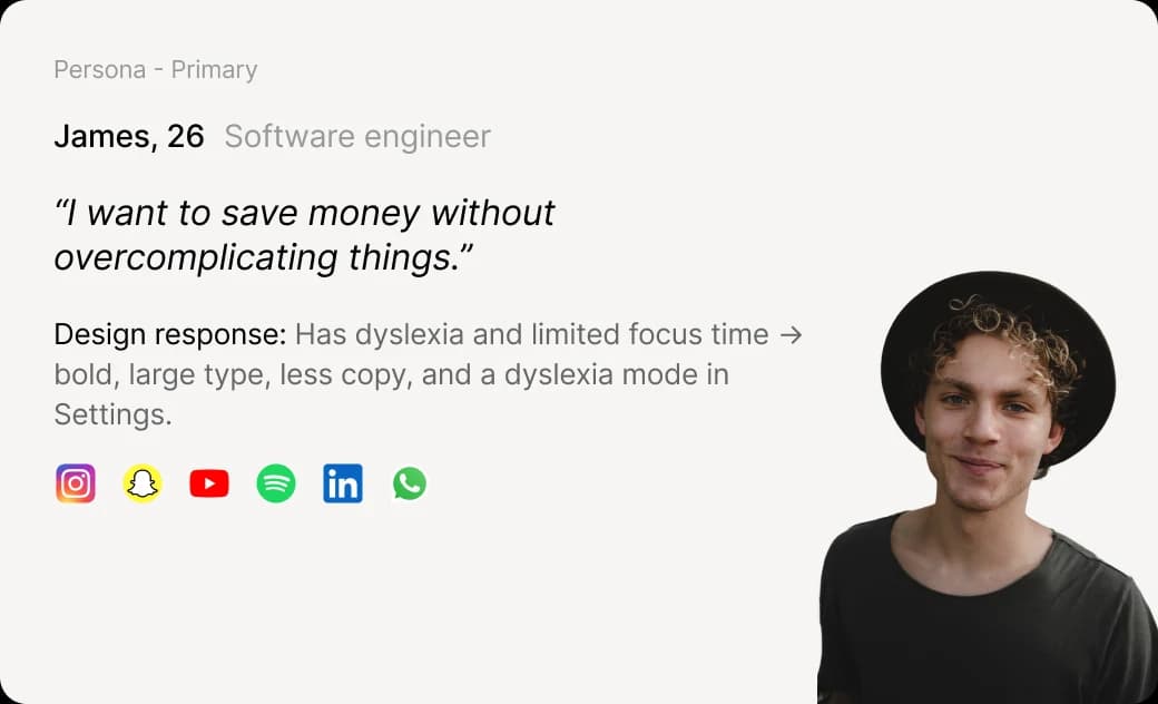
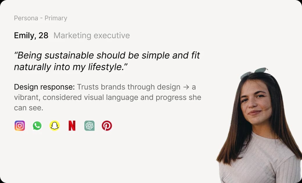
Three personas, all based in Glasgow, kept every later decision anchored to a real need.
Competitor audit
I audited Octopus, OVO and E.ON Next for brand personality, tone of voice, navigation and conversion patterns, then studied E.ON Next in depth for its clarity.

- Excitement and competence. Playful tone, Hick’s law in category choice, a quote input in the hero.
- Sincerity and competence. Confident tone, step-by-step install guidance, an address input for a quick start.

- Exceptional clarity, highlighted keywords and mascot-led illustration, held back by eye-straining colour and a crowded footer.
Define
Turning research into flows, structure and a clear scope.
User journeys
I mapped the two journeys that matter most: creating an account and sharing energy with the neighbourhood. Mapping them exposed pain points early and kept every screen tied to a goal.
- Screen
- Register
- Action
- Enters their postcode
Asking for the postcode first means every tariff shown afterwards is relevant to where they live.
Develop
Exploring widely, then narrowing through wireframes and testing.
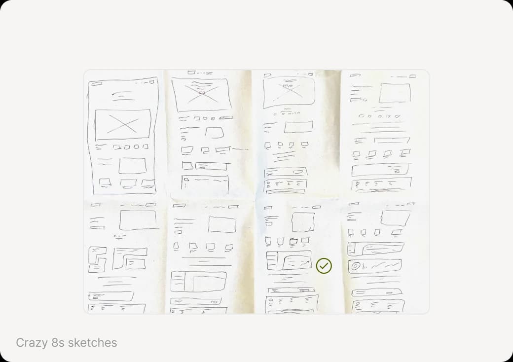
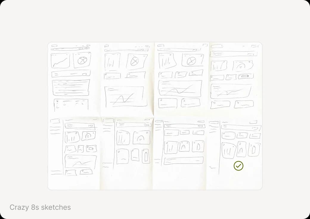
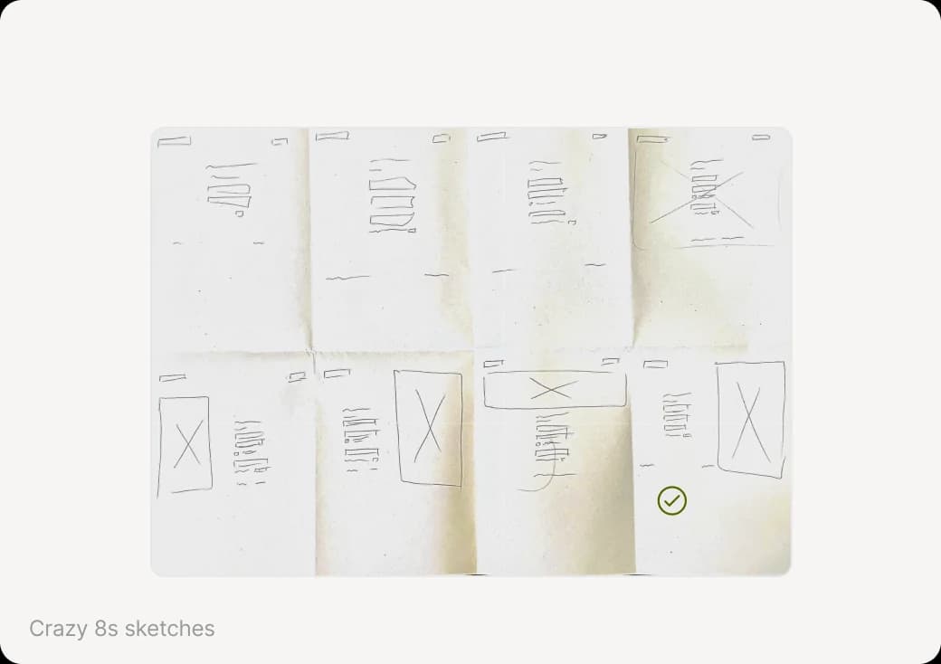
Crazy 8s
Eight ideas in eight minutes for the home page, dashboard and login. Speed forced me past the obvious first answer. The dashboard began with every value on one page; the sketches led to splitting it into an overview and a dedicated sharing page.
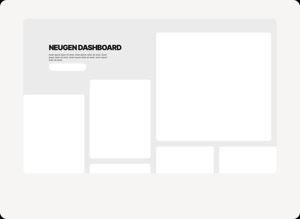
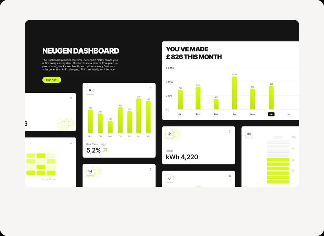
Wireframes
Low-fidelity wireframes fixed the hierarchy and layout of every key screen, from the home page to the four-step sign-up and the sharing drawer. Mid-fidelity added real content and tested the flows before any visual design.

Usability testing
I ran a usability test on the mid-fidelity prototype to check that people could complete key tasks before visual design began. Structure and flows held up; two issues did not.
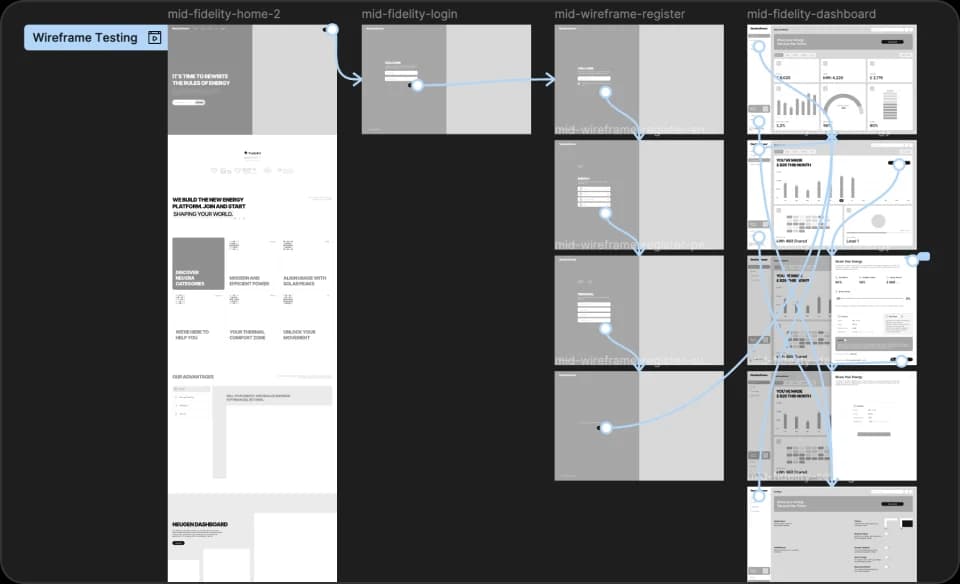
Tested with one participant (22, MSc student). A small, honest sample: enough to catch structural problems early, not to prove outcomes.
- Finding
- Participants skimmed past most of the copy.
- Change
- Shorter text, more visual and animated storytelling in hi-fi.
- Finding
- No way back from the dashboard in the prototype.
- Change
- Added clear back navigation and a persistent sidebar.
Deliver
A brand, a system and a finished website built on everything above.
Visual direction
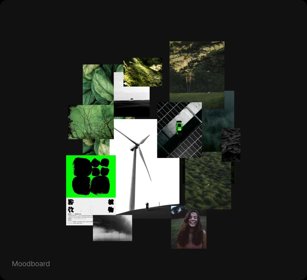
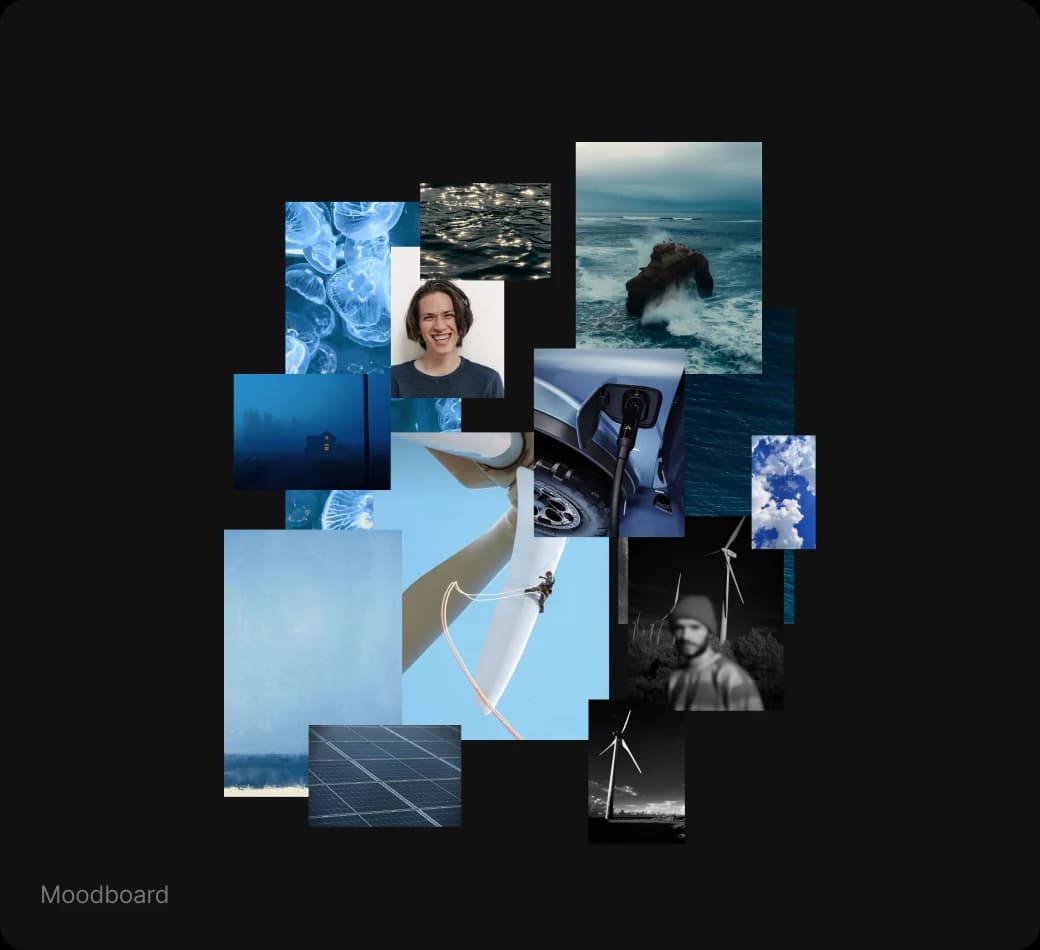
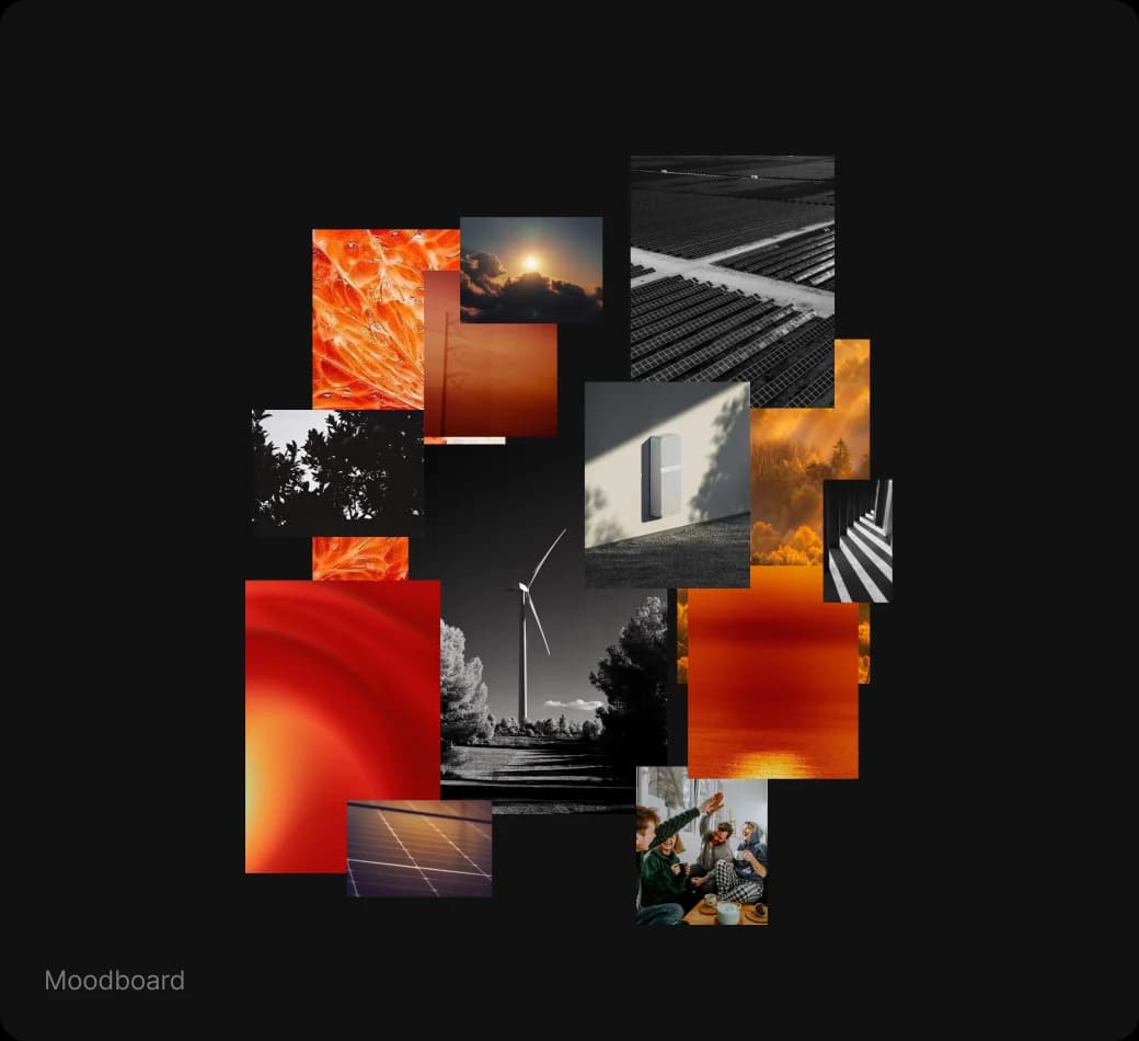
Three moodboards tested three personalities. I chose green and black: green ties the brand to renewables and to ScottishPower’s palette, black adds a premium, high-tech edge.
- Green + black · chosen
- Sustainable, modern, expert. Energetic without feeling unsafe.
- Blue + white
- Trustworthy but already owned by traditional utilities and banks.
- Red + yellow
- Urgent and joyful, but red reads as alert and error, the opposite of financial calm.
 Selected
Style tile
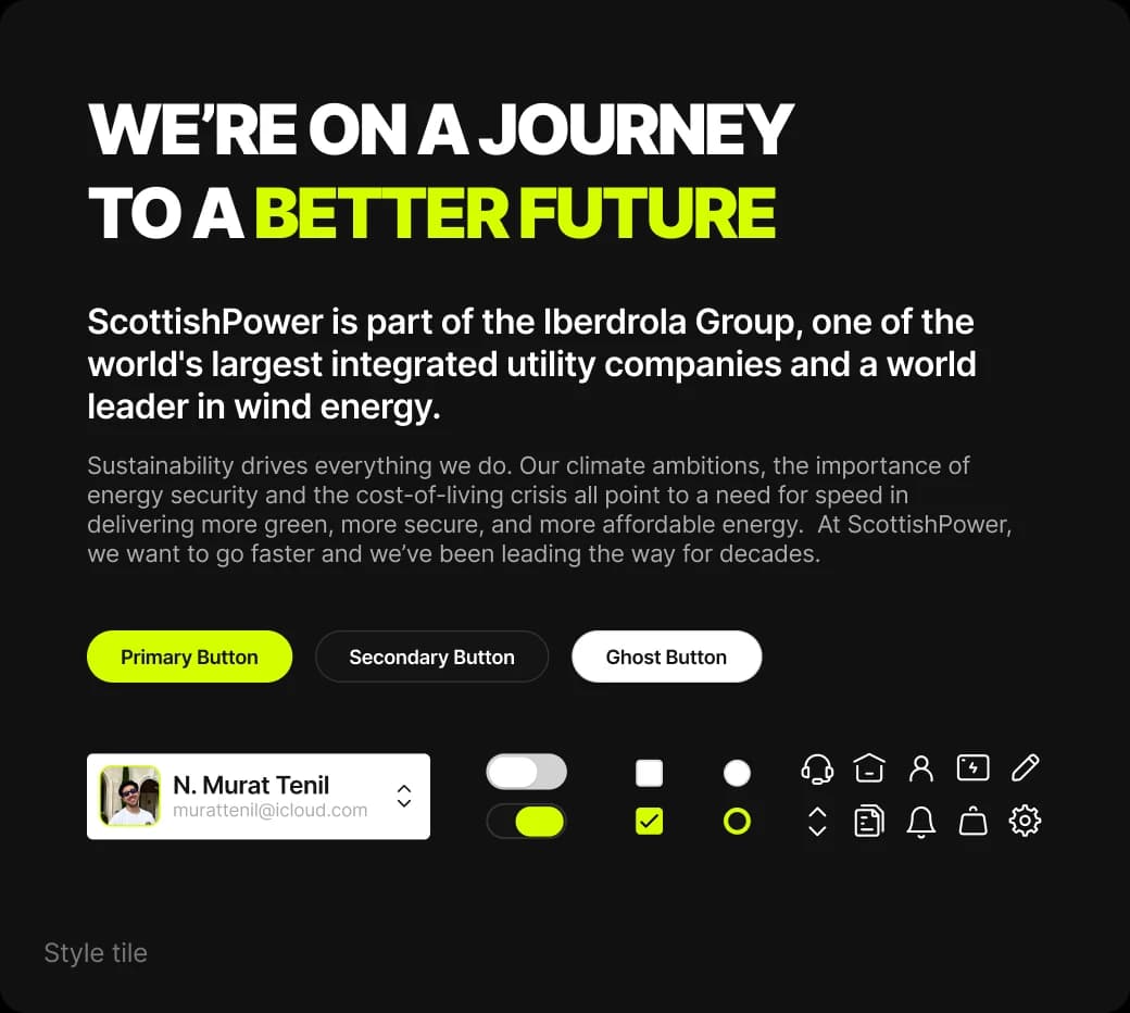
Before full screens, a style tile locked tone of voice (energetic, responsible, expert), type, colour and button styles together, so every page that followed spoke with one voice.
Design system
A tokenised system kept every screen and breakpoint consistent and made handoff predictable. Every colour has a role, not just a value.
- Primary 500 · #D5FF00
- Main action
- Primary 300 · #E6FF66
- Hover
- Primary 600 · #ABCC00
- Pressed
- Neutral 600 · #8F8F8F
- Inactive text
- Neutral 200 · #E0E0E0
- Stroke
Success, error, information and warning — each with dark, base, light and lighter steps for text, fills and backgrounds.
Inter throughout: Black at −5% for display, Semi Bold at −2% for headings, Regular at −1% for body. Tight tracking keeps large type punchy for short attention spans.
Concept
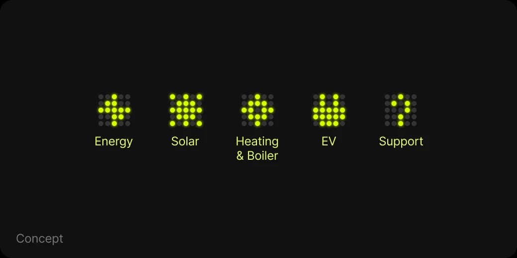
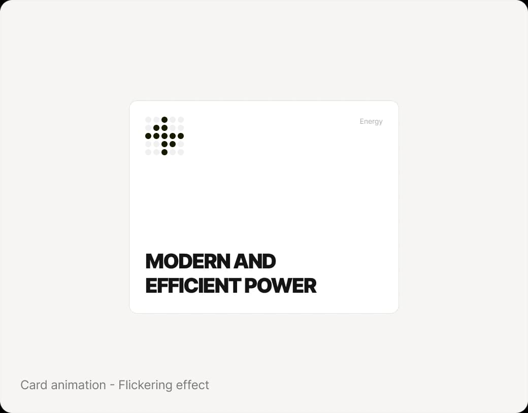
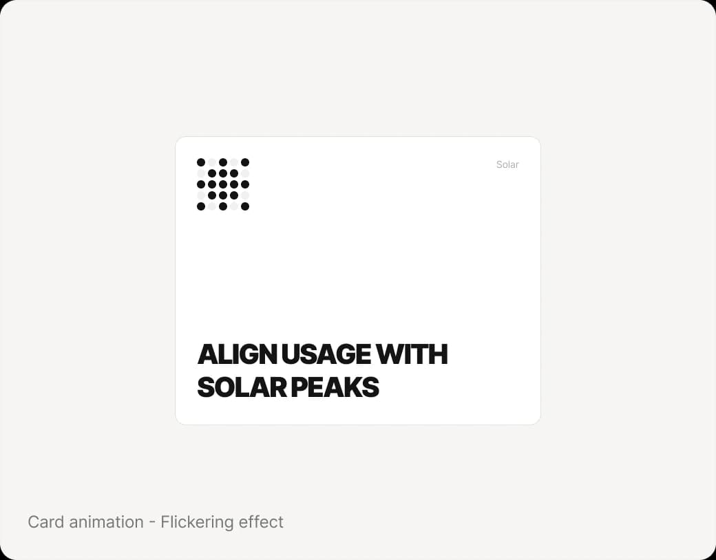
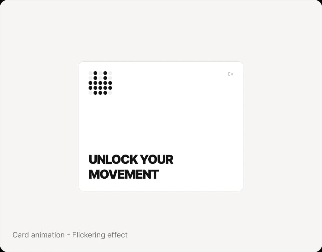
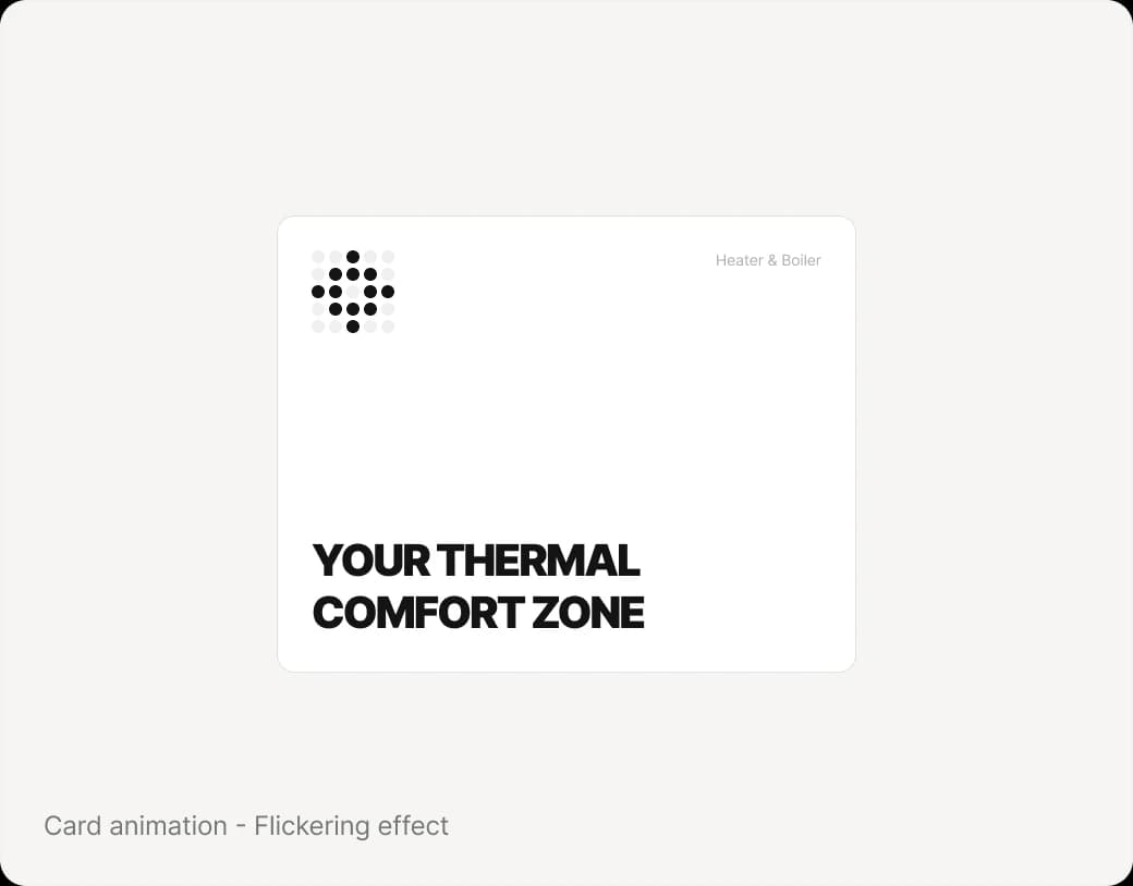
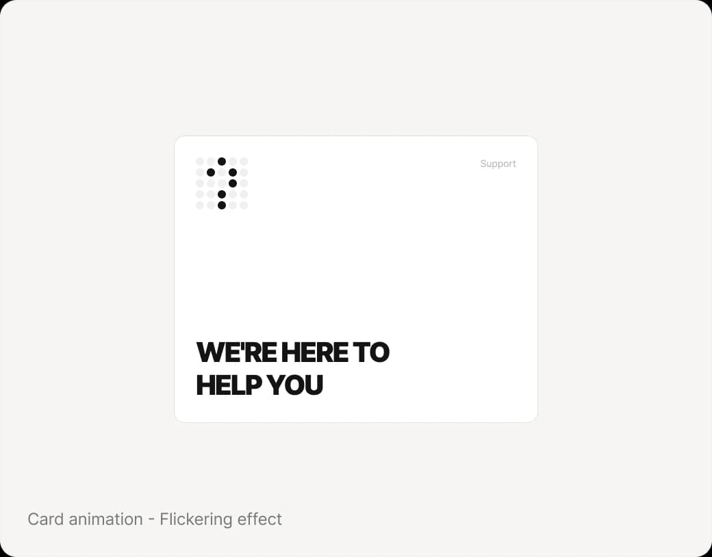
It has been designed modern and creative concept. Concept has dot background for consistency then NeuGenPower categorizes shows in dots like light effect. Also, it was inspired by the flickering effect that used to occur when we switched on the light bulb. My purpose is build a bridge between old feelings and new modern design.
The website - High Fidelity
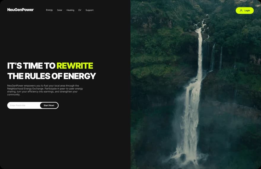
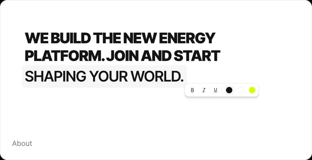
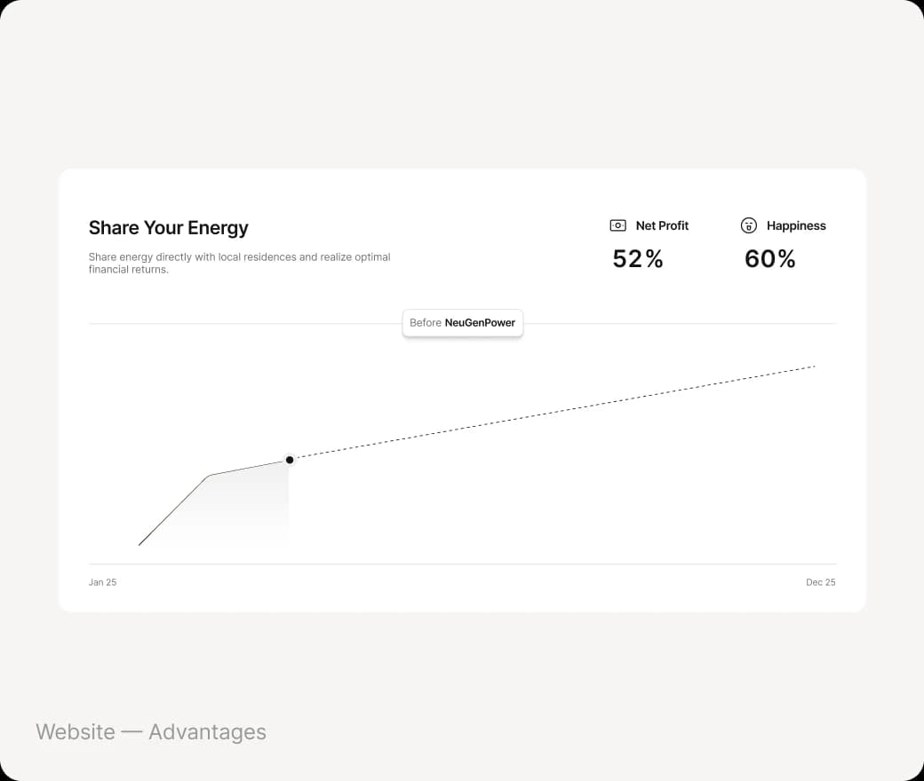
The finished home page tells one story from top to bottom. Each section has a single job.
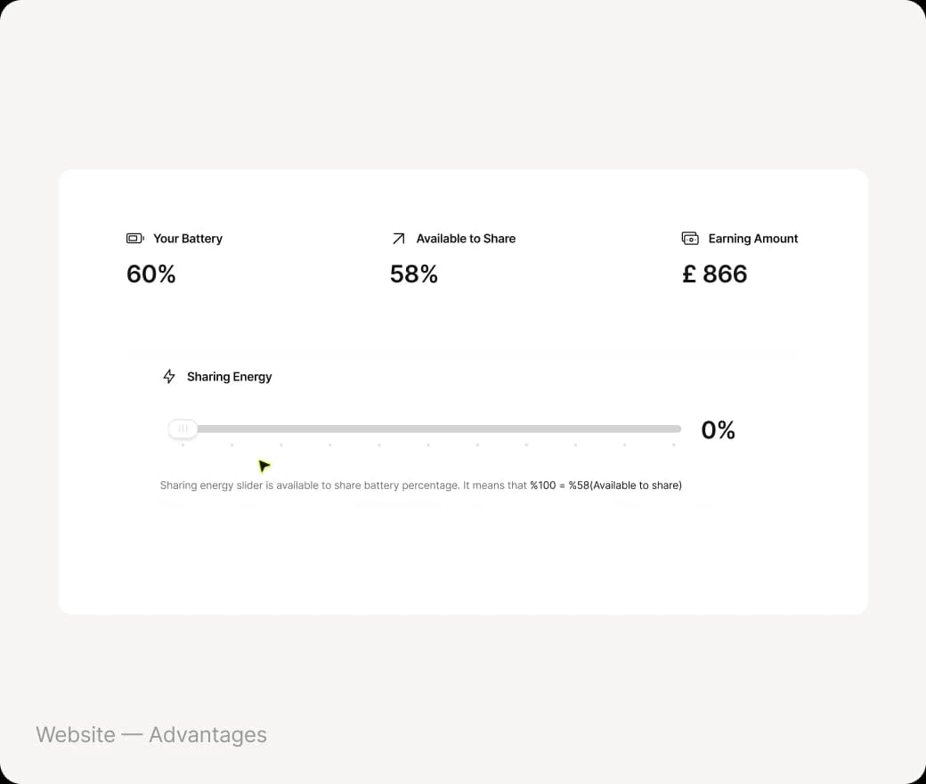
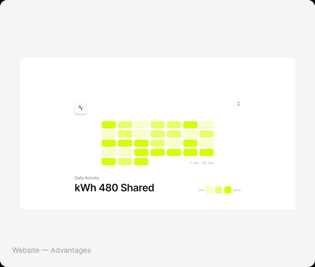
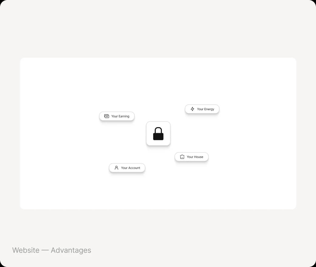
The Panel - High Fidelity
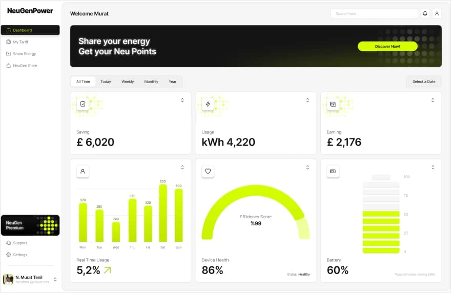
The finished home page tells one story from top to bottom. Each section has a single job.

Dyslexia Mode
Special accessibility with special font size for dyslexia people
Accessibility & heuristics
WCAG and the POUR principles shaped every interactive element; Nielsen’s heuristics shaped every flow.
- Perceivable
- Contrast-checked lime on dark, never colour alone
- Operable
- Every control reachable by keyboard
- Understandable
- Plain-language tariffs, one idea per card
- Robust
- Semantic structure, works with assistive tech
- Nielsen heuristics
- Visibility of status, consistency, error prevention
- Dyslexia mode
- A Settings option built directly from James’s persona
- Error prevention
- Share energy asks for explicit confirmation before transfer
Reflection
Designing NeuGenPower showed how modern UX and accessibility can make a traditional industry feel approachable. Research and personas set the direction before a single pixel: modern colour, big and short type, and interaction over text.
“Before I found my dotted concept, I didn’t know I needed a concept.” Competitors used illustration to explain energy categories; the dot-matrix system became NeuGenPower’s answer, and the brand’s signature.
- 1. Modern, interactive UX is what attracts and keeps new-generation users.
- 2. Accessibility and usability build trust in service industries.
- 3. Clear, short messages drive engagement in complex domains like energy.
- 4. Wireframing and testing early saves time and budget later.
What I’d do next
- — Test hi-fi with 5+ participants across both audiences, not one.
- — Measure sign-up completion and time-to-first-share as success metrics.
- — Validate dyslexia mode with dyslexic users and run a full WCAG 2.2 AA audit.
Links
1. NeuGenPower is a concept brand powered by ScottishPower. All metrics shown in the interface are illustrative.


