Lefta
Finance · Investing & ISA mobile app · 2025
Lefta is an investing and ISA app concept for Gen Z and Millennials in the UK, imagined as a Barclays sub-brand¹. Its name comes from the Greek λεφτά (leftá), meaning money.
This page shows the app through its interactions and the reasons behind them. The research, personas and testing are in the full case study.
Situation What was the problem or issue that I faced?
Young people in the UK want to invest, but money, knowledge and trust hold them back: 70% say they don’t have enough to invest, and 25% don’t know what to invest in.
Task What did I have to do to fix this?
Design a mobile app that makes investing and ISAs easy to understand and safe to start, for 18–30s first and 30–45s second.
Action What were the steps that I took?
I owned the project from research to a hi-fi prototype. I ran heuristic tests on three competitors, built personas, prioritised with Kano and MoSCoW, and tested wireframes before hi-fi. Then I designed the interactions and motion: the deposit flow, onboarding, and gamification with tasks, XP and level badges.
Result What happened and what was the benefit?
A hi-fi prototype covering sign-up, deposit, investing, ISAs and learning, with dyslexia and colour-blind modes built in. Testing cut sign-up from 16 screens to 9.
Process
The work followed the Double Diamond, from research to a hi-fi prototype. The research is summarised here; the full version is in the PDF.


Market research, demographics, heuristic tests
Jakob Nielsen’s heuristics and the 5Es of usability kept every screen effective, efficient, engaging, error tolerant and easy to learn.
Research in short
Young people in the UK want to invest. Money, knowledge and trust hold them back, not interest.
Each finding became something you can see in the app.
- What I found
- What I designed
- 70% don’t have enough to invest
- Tasks start at £20, and budget ranges start low.
- 25% don’t know what to invest in
- Three questions before the first investment, and Learn as a main tab.
- 25% are afraid to lose money
- A projected range before buying, and a way back on every screen.
- Gen Z loves games and keeps up with friends
- XP tasks, level badges and an anonymous comparison.
- Competitors had busy pages and no search
- One job per screen, and search in Learn.
- Liam has dyslexia and protanopia
- Appearance settings with a dyslexia mode and colour modes.
Design system
A tokenised system with Mykonos Blue at its centre. Tints and shades move in ±10 lightness steps, so the hue never drifts, and every colour has a role, not just a value.
- Primary 500 · #009CFA
- Main action
- Primary 400 · #2EB0FF
- Hover
- Primary 600 · #007CC7
- Pressed
- Neutral 500 · #717784
- Inactive text
- Neutral 200 · #E1E4EA
- Stroke
Sign-up
User testing showed the first sign-up was too long and boring. I cut it from 16 screens to 9: one question per screen, with the title, input and button always in the same place.
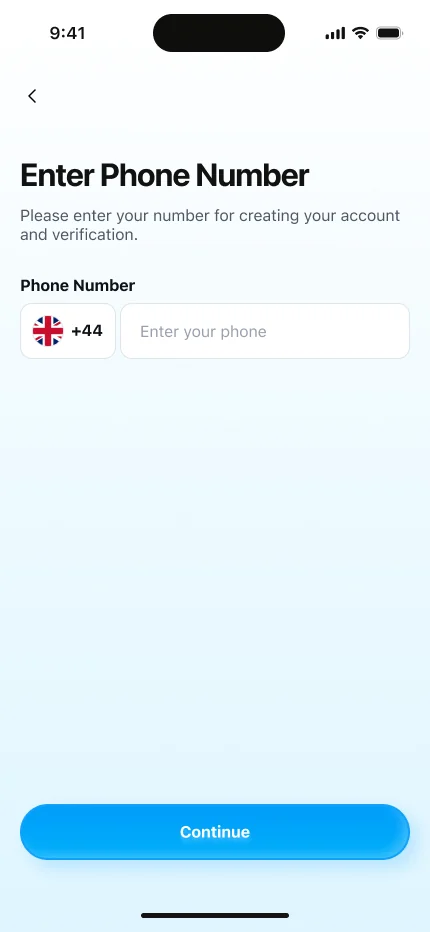
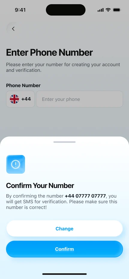
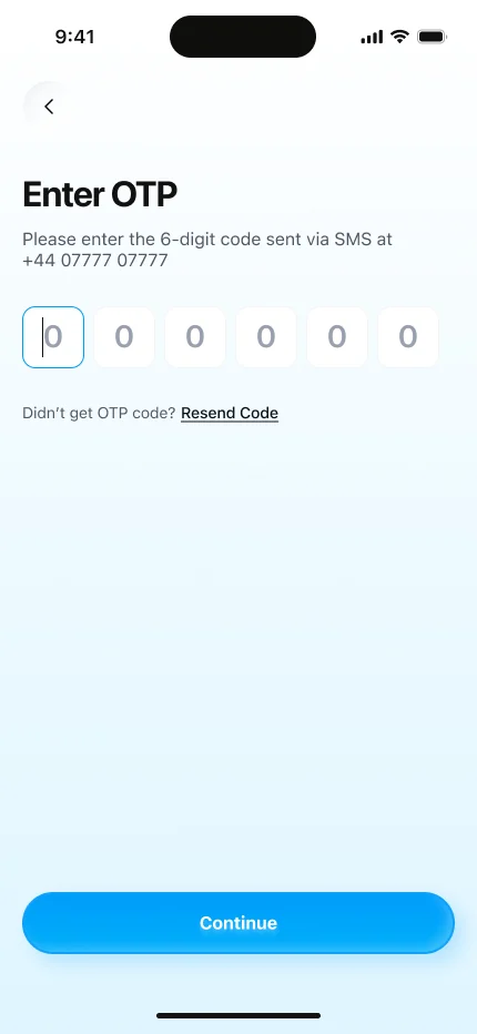
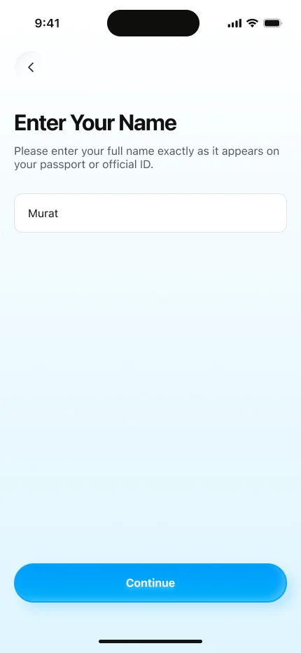
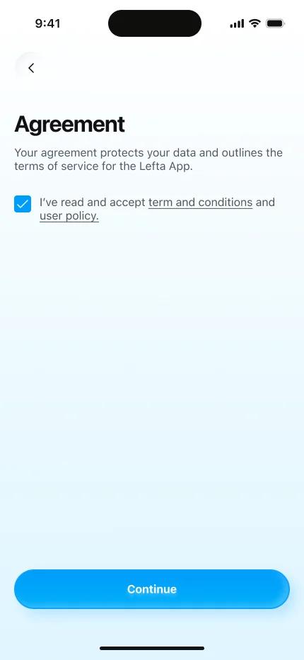
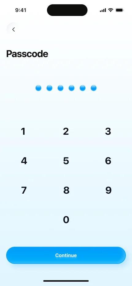
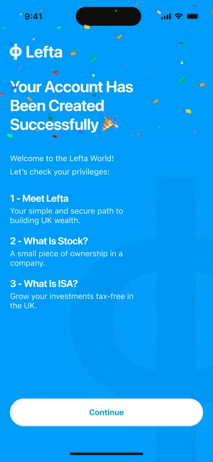
It starts with one field, not a long form. The country code is already set to the UK.
Onboarding
Three short slides explain Lefta, stocks and ISAs before anyone is asked for money. One idea per slide, so they can be skimmed.
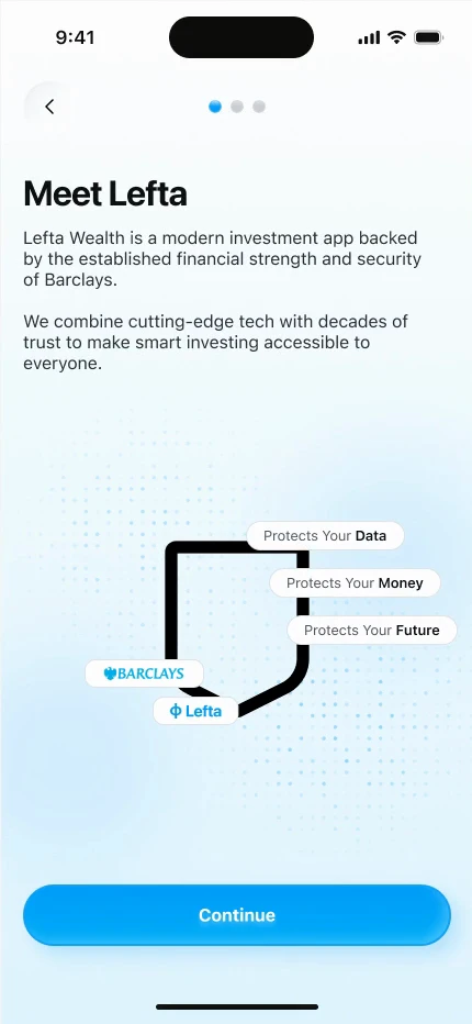
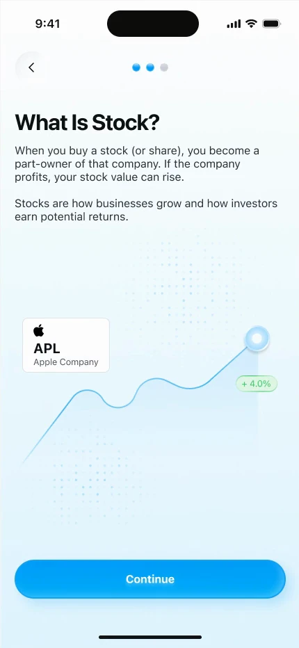
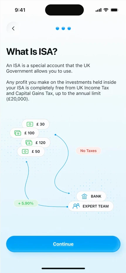
Who is behind it. Being part of Barclays is the first trust signal.
Home
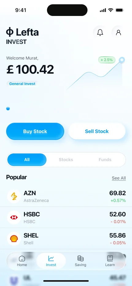
Home answers “how am I doing?” first. Everything below it is one tap from an action.
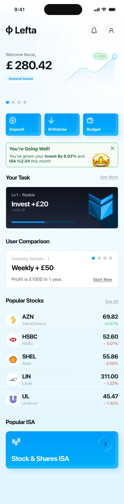
Balance and this week’s profit on top, with a small graph instead of a full chart.
Adding money
Money is where trust is won or lost, so the deposit never leaves you guessing. Every stage, from connecting to the bank to the money arriving, is named on screen: Nielsen’s first heuristic, visibility of system status.
- Amount
- Amount and bank account on one screen, with where the money comes from written under it.
- Connecting
- It names what is happening: Connecting to Barclays.
- Connected
- A tick confirms each stage, so a pause never feels like a freeze.
- Depositing
- “Money is being deposited” — the last wait is named too.
- Done
- The gold coin and confetti mark the moment, and the amount is repeated so it can be checked.
Investing in three questions
Before the first investment, Lefta asks about purpose, budget and knowledge. The questions moved here from sign-up, to the moment where they actually make sense.
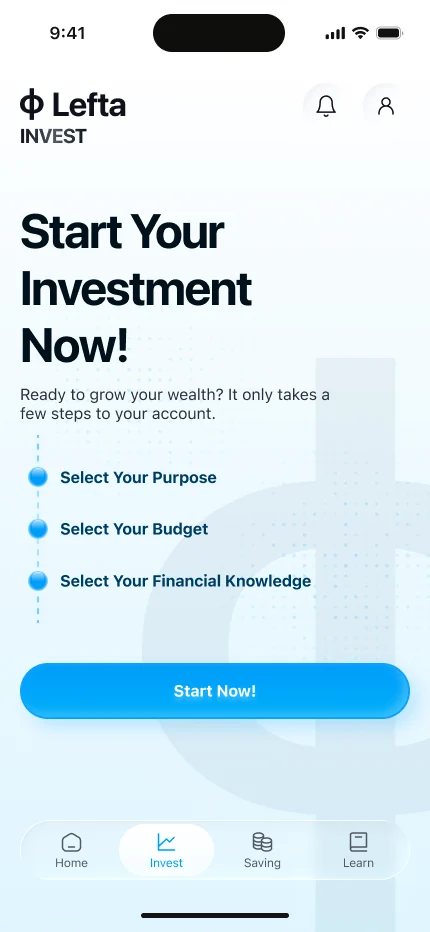
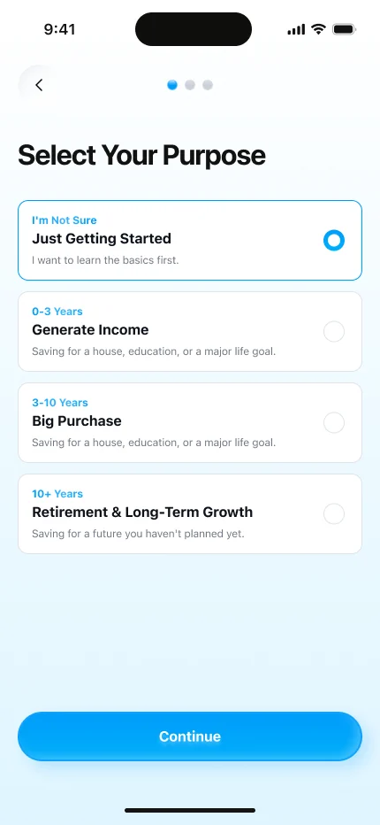
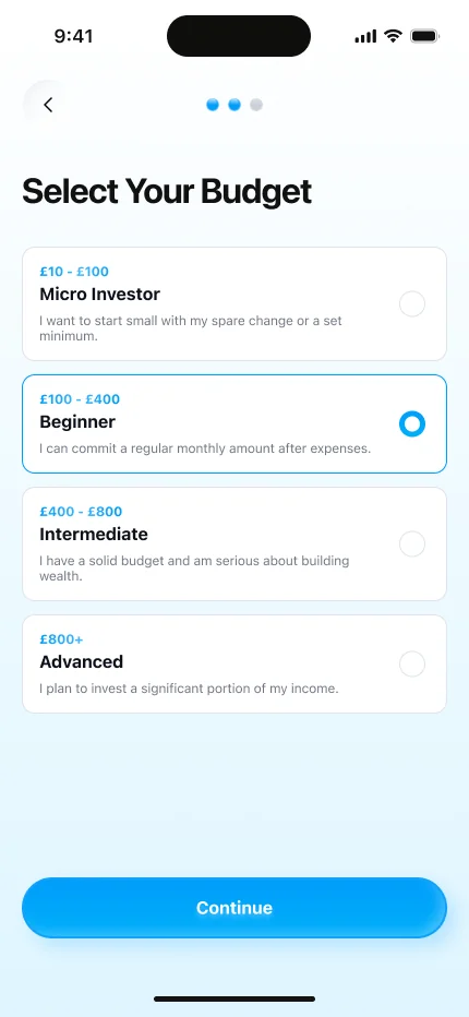
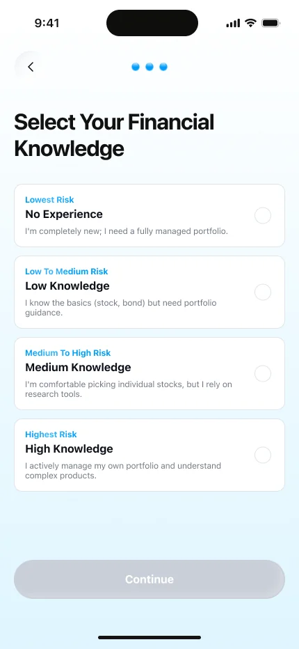
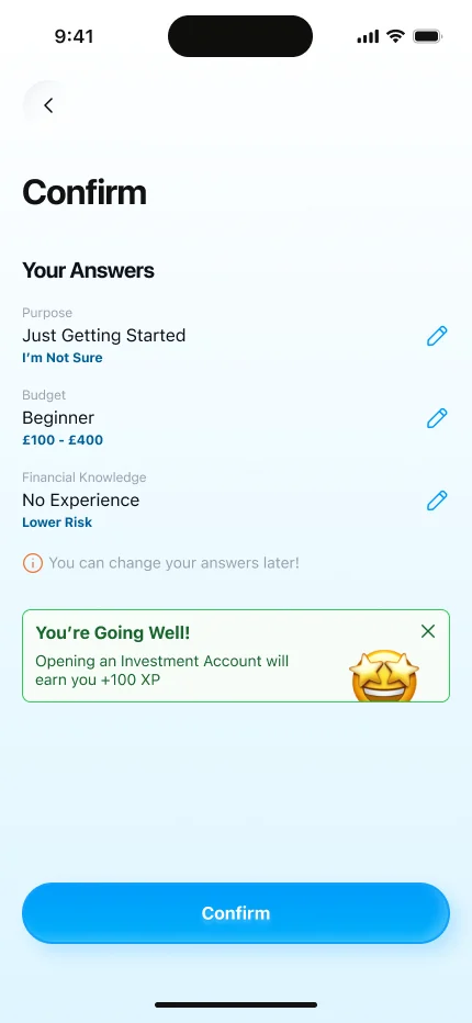
The three steps are shown up front, so users know how long it will take.
Saving and ISAs
ISAs are why most people in the UK start saving, but the four types are confusing. Saving explains them first, then shows the future value before you commit.
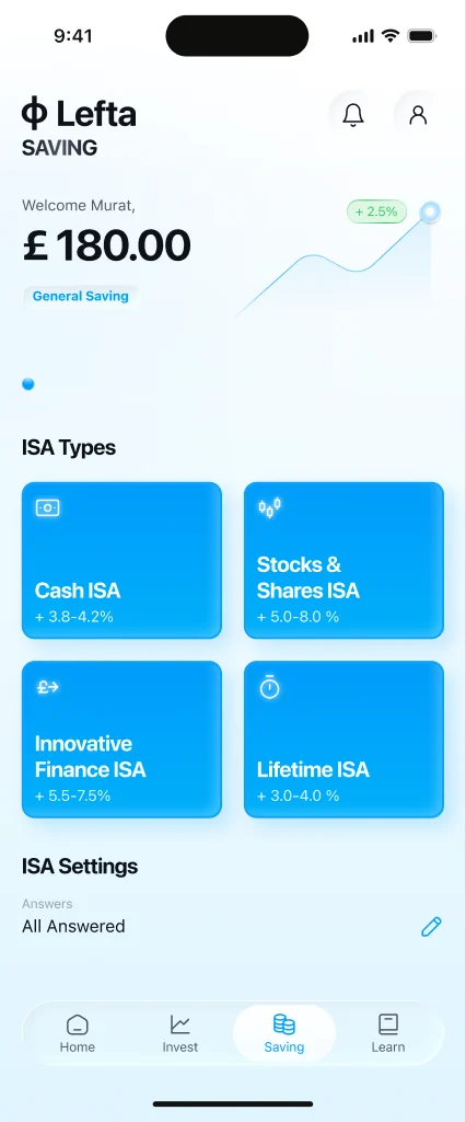
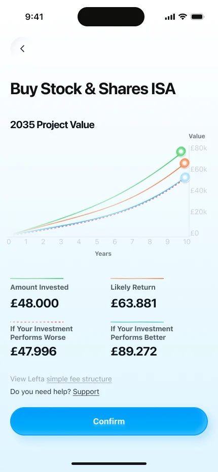
Total saved, then the four UK ISA types as cards with their rates, so they can be compared at a glance.
Gamification
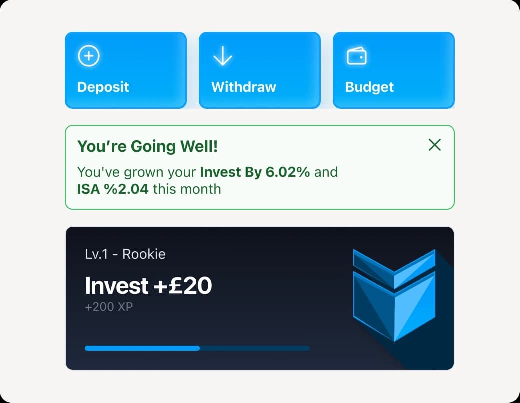
Tasks like “Invest +£20” earn XP and level badges, from Rookie to Explorer. I only reward habits that are good for the user, like small regular deposits, never trading more often.
Learn
25% don’t know what to invest in, so learning is a main tab, not a help page. Courses are short and earn XP, so learning moves you forward like investing does.
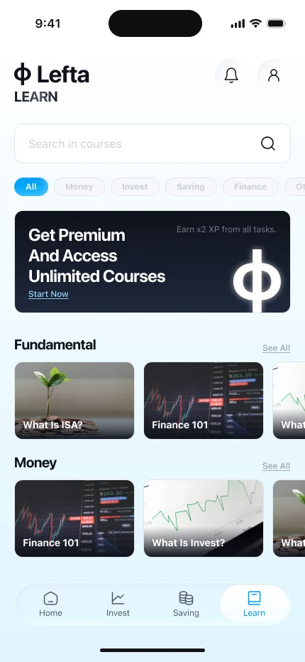
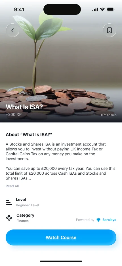
Search, categories and short course carousels. A few cards per row keeps choosing easy.
Accessibility
Liam, one of the personas, has dyslexia and protanopia. Appearance offers text sizes, a Lexend dyslexia mode and colour-blind modes, with a live preview at the top.
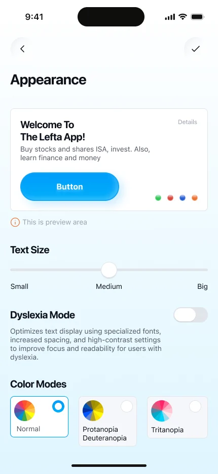
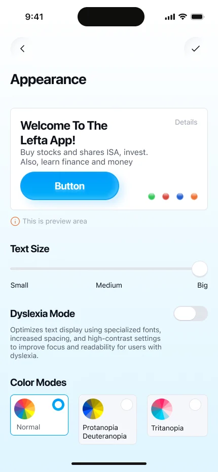
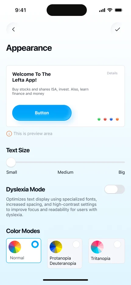
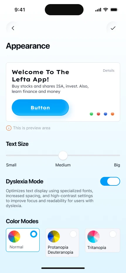
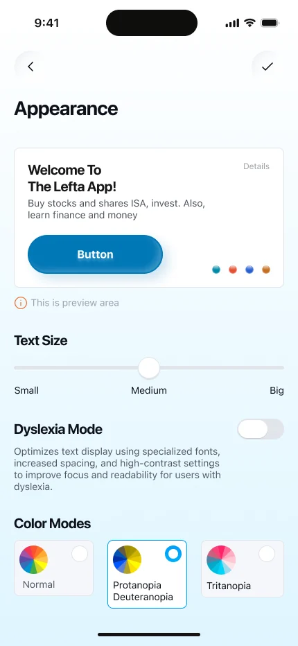
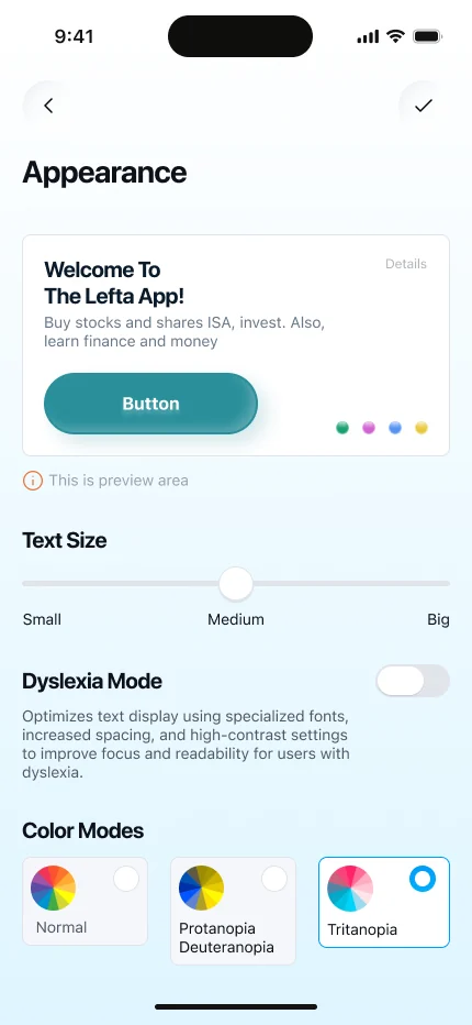
The preview at the top changes live, so users see the result before they leave the page.
Reflection
- What worked
- Tying every feature to a persona need made prioritising easy, and Kano with MoSCoW kept the scope honest.
- What I learned
- Test early. Sign-up felt fine to me but long to users, and fixing it at the wireframe stage saved rework.
- What was hard
- Balancing playful gamification with the trust a finance brand needs.
What I’d do next
- — Test the hi-fi prototype with more Gen Z users
- — Measure time to first deposit and sign-up completion
- — Design the in-app community and friends leaderboard
Links
1. Lefta is a concept brand created for a UX project, imagined as part of Barclays. Figures in the interface are illustrative; research figures come from the sources listed in the PDF.


